Bit ‘o setup
I think the TPACK framework is one of the most influential things I have learned about/grappled with this past year. As an instructional coach in the middle of an educational technology implementation, this is one piece I have relied on heavily for personal focus and planning.
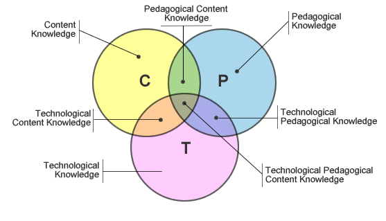
One thing I worry about with concepts of this depth (that possess a graphic illustration so perfectly simple) is that the real idea gets misinterpreted by any old joe who does a copy/paste of the Venn diagram from a Google image search. You’ll see what I mean in the diagram below. I’m not saying the diagram is in any way off the mark. What I am saying is that the visualization is so elegantly simple that I think for some it might not at first glance convey the sophistication of the concepts presented. Would I change it? Not one bit. I think it is a really good example of distilled reality. Judge for yourself:
When it works
However, this post isn’t just another nod toward the synthesis of visualization and concept present in the TPACK framework (formerly TPCK). It is also about a brief and recent e-mail exchange between one of the originators of TPACK and I. Punya Mishra, professor of educational technology at the College of Education at Michigan State University, has been a fixture in my blogroll since I started nashworld. In my opinion, the TPACK framework is one of the few things in educational technology that you can truly hang your hat on. Tools will come and go, popular methods of instruction will as well… and content? Content changes in the blink of an eye in 2009. However, to me this framework is core to what we do (or should be doing) in education. And with a mouthful like “technological pedagogical content knowledge,” it really does help to have a visual representation that nails it cold like this one does.
Inspiring connections
I honestly don’t remember exactly how I first found Punya’s blog, but I instantly connected to the eclectic nature of it. Particularly, the fact that he is not only deep into edtech, but is also a huge fan of all things regarding the visualization of information. I too am fond of creative and innovative ways of visualizing data of all types. My mixed life as a generalist instructional coach (who also teaches biology and marine biology) is one that often blends strategies for learning data with methods of collecting and interpreting it.
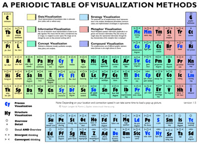
From reading his brief but frequent posts sharing precious nuggets of visualization, I now think of his blog whenever I find one of interest that is new to me. So just a few weeks ago, I sent a different sort of link that included a visualization about visualizations… and to top that, it was bent and twisted into the familiar form of the “periodic table” of elements. My knee jerk on this one was not favorable. However, I thought I’d e-mail it to Punya to get his objective take. What developed into a small back & forth via e-mail, then developed into a full-blown post confirming not only what I thought he might find, but then quite a bit more. For a table about visualization methods, this could easily serve as an “anti example” itself.
Visualization risks
Punya makes the case that it works to do this in sort of a humorous way, and provides several examples in his article. I even have an example of this hanging above the sink in my own classroom. The Periodic Table of Fruits & Nuts was given to me as a gift back in the days when I taught an Honors-level Botany course to Juniors & Seniors. We had fun with the poster. In fact, it is quite pretty and really does display a ton of information. But I always made sure to point out the massive misconception machine that it was… in taking the shape of the periodic table of elements. The main point being, the table of elements is the shape it is because of the periodicity of the elements within. I assure you there is nothing periodic about the latin names of fruits, nor the caloric value of the nuts in my poster.
Everything that deceives may be said to enchant.
~Plato
Upon more closely mining the site for the source of this document, I finally found the original paper by Ralph Lengler & Martin J. Eppler of the Institute of Corporate Communication, University of Lugano, Switzerland. So, I suppose it makes sense that this does not have roots within the natural science community. All scientific inaccuracy, and creation of misconception aside, the authors apparently realized a few of the limitations themselves. The conclusion on page five states that the chart, “…cannot be seen as a close adaptation of the periodic table of chemical elements. It is rather a functional, metaphoric homage to it.”
However, the Plato quote above was lifted from another paper linked to the site, from the same university, entitled: “The Risks of Visualization.” It seems that this second paper might have some further suggestions for the first, huh? There are some other interesting non-examples presented in this paper. Check them out toward the end of you have time.
What is happening?
Are you doing this at all? If so, how do you address visual literacy in (or out) of your curriculum? What do you do to help students acquire skills in this area? What supporting sources do you use? Do you have a colleague who is doing this really well? Have them weigh in. I want my kids to be visually literate. I think addressing this by the time a student is 18 is important. I think I personally have a reasonable level of skill in this area. I try my darndest whenever possible to address visual literacy. However, this is a far cry from being organized, efficient, and well-equipped to do so.
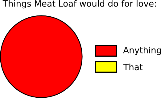
Other artwork thanks: *Untitled by Ariel.Chico on Flickr *Meat Loaf graph? I wish I could credit this one, but it is too viral for me to decipher the origin.


Sean, thanks for the followup to my posting. Cool of you catch the apparent paradox between two different papers by the Swiss folk! Really hits the point home.
Visual literacy is of great interest to me.. sadly not enough hours in a day (or year) to devote to it. You may find my post titled “degradation of Matt” to be interesting in that regard. Not giving the link here but it is on my website right on the front page (you may have to scroll down a bit).
@Punya, I’ll post the doggone link: http://punya.educ.msu.edu/2008/03/13/the-degradation-of-matt/ 😉
…because it is a fantastic post. Of course I remember it. Not only is the degradation of Matt’s face into a circle with a earring… quite amusing, it really does illustrate your larger point. GOing back to get the URL of the post, I was surprised to find that I hadn’t left a comment. I remember thinking how cool it was to read the title of the book you mentioned your mother giving you. A classic Indian botany textbook.
That brought back not only memories of my childhood reading, but of introducing my honors botany students to “The Flora of Missouri” by Julian A. Steyermark. The line art within is still exemplary today, and had to be. You needed to be able to make the final determination of a plant’s identification by an image-check after chasing it through the dichotomous key.
Funny- I have always highlighted biological illustration to my students as an interesting and valuable endeavor. Whenever I use an image from the 1940’s (which is frequently) to illustrate a point, I now try to also include images from current textbooks juxtaposed. We spend a few minutes evaluating exactly why the images differ with regard to detail. What are the positives (simplicity, scaffolding, etc.) and the negatives (lack of specificity, potential creation of misconceptions, etc.) of each illustration.
Re-reading this today has inspired me to scan in some images created by students in my botany classes of old. Some of it was just too good to destroy. As always, thanks.
TPACK on, Sean! I enjoy reading your blog. Keep up the good work.
@Matt, …oh I (we) will. starting Wednesday, the 11th… we are using TPACK as a direct and purposeful framework for what we do going into year two of our tech integration project. Our cohort of 20 teachers will then begin to help me take the mission to the remainder of our high school staff.
Thanks much for the pat on the back as well. Funny how far a little sentiment like that can carry a person some days…
Sean,
Great post here! I appreciated the tie-in between the TPCK diagram and visual literacy in general. Oh, and the Meatloaf visualization was a classic 😉
In my classroom, I find visual literacy has become highly important. Take, for example, my freshmen in Biology. We are currently wrapping up our unit on photosynthesis and cellular respiration. In our curriculum, our standards state the the students will not be assessed over the intermediate reactions – and frankly most of my students could care less about those intermediate reactions – too abstract. However, is there great value in looking at a diagram of those reactions, and trying to decipher what is happening as well as the overall result of those reactions? I believe so.
In my Zoology class, we will sometimes spend an entire period with one image – making observations, inferences, and questioning the content.
Can visualizations sometimes create problems in the classroom? Certainly. I have seen one too many classrooms mess up a food web- must be something about those arrows.
Thanks for the post.
@Erin, I love how you can sit across the house, holding a baby… and type this with a tone of being miles away. You’re fired. 😉
And “thanks for the post”? Nice. Some mornings it’s “thanks for warming my car up.” Today it’s “thanks for the post.” Funny how we treat the web as such a public space, even from across the space of a home…
I know this is besides the point, but since you mentioned periodic tables… this is the most compelling rendition I have seen: http://periodictable.com/
Click on the element for more delights…
@ellenpham, YEs… I love that site. I haven’t sen it for a while though. Thanks for adding that to the discussion. That is a good example of taking a really dry (though scientifically-derived) chart and transforming it into a visual that is more engaging for certain.
So- I will see that chart, and raise you this one: http://theodoregray.com/PeriodicTable/
This “table” really IS a table. 😉
The site is so much more extensive than you can see at first. Forward that one on to your sciencefolk. The history on the construction of the table is pretty interesting as well.